One of the things that I love most about data analysis is the part where you get to really dig into the details of the data set. What’s the methodology? What are the limitations? What does it all meannnnnn?
This week’s Makeover Monday challenge was another relatively small data set. And when I started really diving into it, I stumbled across a really interesting issue. There were actually a few issues I had with this data set, which I will cover later, along with the viz I created, but for the purposes of this post, I’m going to concentrate on a singular pitfall: the logical NOT versus the semantic NOT.
But first: background!
This week’s challenge
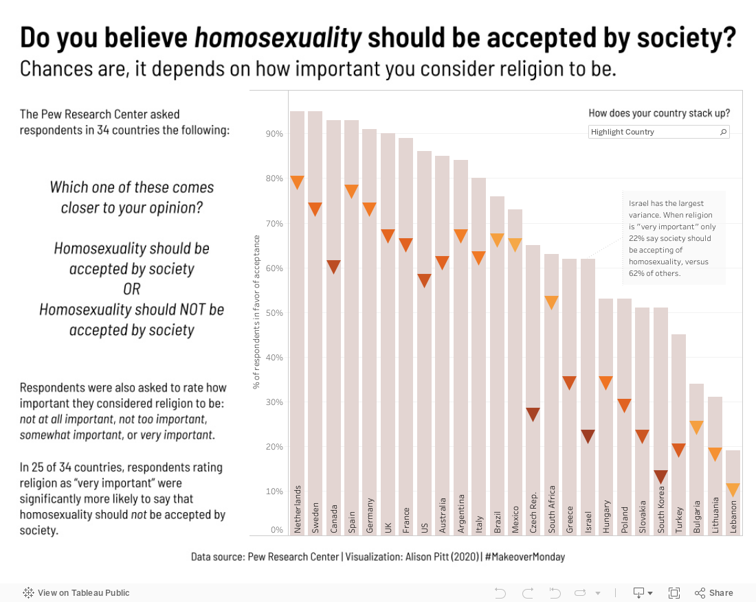
This week’s (2020w29) data set was from the Pew Research Center, who surveyed people’s attitudes towards homosexuality across the globe. The data set for the challenge was from one table, which compared (roughly) people’s attitude towards homosexuality based on how important they thought religion was. The title of the table in the report was “People who see religion as less important in their daily lives are more accepting of homosexuality”.

“People who see religion as less important in their daily lives are more accepting of homosexuality”. Image Pew Research Center
So what’s the problem here? You have to read the small print! Pew listed the columns as “Religion is very important” and “Religion is NOT very important” but the fine print underneath says, “Respondents who said religion was somewhat, not too or not at all important in their lives make up the ‘Religion is NOT very important’ category.” They’re presenting their data here in a way that’s easily misconstrued: they’ve used a logical NOT in a way that looks like a semantic NOT.
What the heck am I talking about, logical NOT vs. semantic NOT?
Honestly, I’m not even sure these are real terms. But they make sense to me. Let’s start with some definitions.
The logical NOT is one data scientists are probably pretty familiar with. It means “the opposite of”. In code, it’s often represented by an exclamation point (!). In pseudocode, it would be kind of like this:
“NOT very important” = !(“very important”)By including everything that wasn’t “very important” in the “NOT very important” heading, Pew Research Center has used a logical NOT.
But wait! Included in the “NOT very important” category is the answer “somewhat important”. This is where we run into the semantic NOT, and a pretty serious issue with this data set.
If you were having a conversation with someone and told them something was “not very important", you would most likely perceive that thing as somewhere below neutrality on the “important” scale. A little like this:
[ not important at all ] - [ not very important/not too important ] - [ somewhat important ] - [ very important ]But that’s not at all what this data set says. There’s a really big difference between “eh, that’s not very important” and “oh sure, it’s important, just not VERY important”. And if you conflate the two in Pew’s research, you could end up with some harmful conclusions.
What to avoid saying
We are not, in this particular challenge, given any sort of indication of the scale of the actual number of respondents to Pew’s question, or how many respondents fall into each category of religion being “somewhat”, “not too”, or “not at all” to them. So based solely on the data set, we cannot make any sort of generalization about whether attitudes towards religion on the whole affect peoples’ views on homosexuality.
By calling the “somewhat” group part of the “NOT” group, Pew has muddied its definition of important/not important, in a way that is very easy to misinterpret. Personally I’m inclined to trust their conclusion, as indicated in the headline, “People who see religion as less important in their daily lives are more accepting of homosexuality”, but that’s pretty much because Pew Research Center has a good reputation. The data we can see in the table doesn’t quite say that for certain, and it certainly does not show the correlation “as the importance of religion increases, the acceptance of homosexuality decreases.”
Various other pitfalls
I promised some other pitfalls that I found. So here they are, in no particular order:
Pew asked respondents to rate how important religion is “in their daily lives”. This shouldn’t be generalized to how important they think religion is, or what their religious affiliation is. Counterexample: 100 casual followers of Religion A in the United States might rate religion as “somewhat” important and 10 devout followers of Religion B, also in the United States, might rate religion as “very important”. Since the most popular religion in the United States is Religion A, you might draw the conclusion that Religion A is less accepting of homosexuality, when the data doesn’t necessarily support that.
Pew also asked respondents to answer the question, “Homosexuality should be accepted by society OR Homosexuality should not be accepted by society.” While it wouldn't be unreasonable to assume that this was the same as asking whether the respondents themselves were accepting of homosexuality, it would still be an assumption.
There were only 34 countries in the entire survey, out of 195 worldwide (as of 2020). Of those 34, only 25 demonstrated a statistically significant variation of the acceptance rate. I bet you though I was going to say that this isn’t enough data to draw a conclusion, huh? On the contrary! Here’s another case where I trust Pew Research Center. If the 25 countries that show a statistically significant variation are sufficiently large and varied that one could reasonably assume they represent the world’s population in general, then that’s good enough for me. That’s pretty much the basis for every survey ever, after all. I’m inclined to trust Pew that they’re satisfied with the sample size.
How I tackled the problem
I decided to focus on the people who said religion was “very important” and how their acceptance of homosexuality compared to “everyone else”. To do that, I faded “everyone else” into the background and drew attention to how much lower the acceptance rate was among that group. Then I used highlighters to encourage viewers to put themselves in the picture. All while trying to avoid the pitfalls above!
Explore my final viz for yourself, below, or check it out on Tableau Public. Enjoy!