Menu

Alison Pitt

×

America’s Breastfeeding Scorecard, showing breastfeeding rates across the states

Putting my money where my mouth is

Alison Pitt May 11, 2022

Sometimes I, like most people, can get a little carried away on the internet. But in my own small way I’m trying to make the world a better place, and to that end I’ve made an informal pact with myself that when I rant on the internet, I have to do some data analysis to back up or complement whatever it is I ranted about.

This week’s edition: the current shortage of formula milk for babies. I’ll link to my rant below, but the gist is: we should take a critical look at the systems we set up for feeding our infants, and who is accountable for ensuring that we can.

Imagine creating a society where women are shamed, cajoled and bullied into becoming dependent on factories to feed their babies, and then letting for-profit companies control all the supply https://t.co/xa4nYeJnTv

— abortion is healthcare (@adastra1930) May 11, 2022

Some background on me: I lived in the UK for half my life, and I birthed and raised two babies there. I benefited from a system of socialized medicine where childbirth is, largely, midwife-led. So the institutions we have in America baffle me (to say the least). So to supplement my Twitter rant, I decided to look at the rate of breastfeeding in the US, as well as income levels (because I was curious) and the type of care we offer new mums (because the data was there).
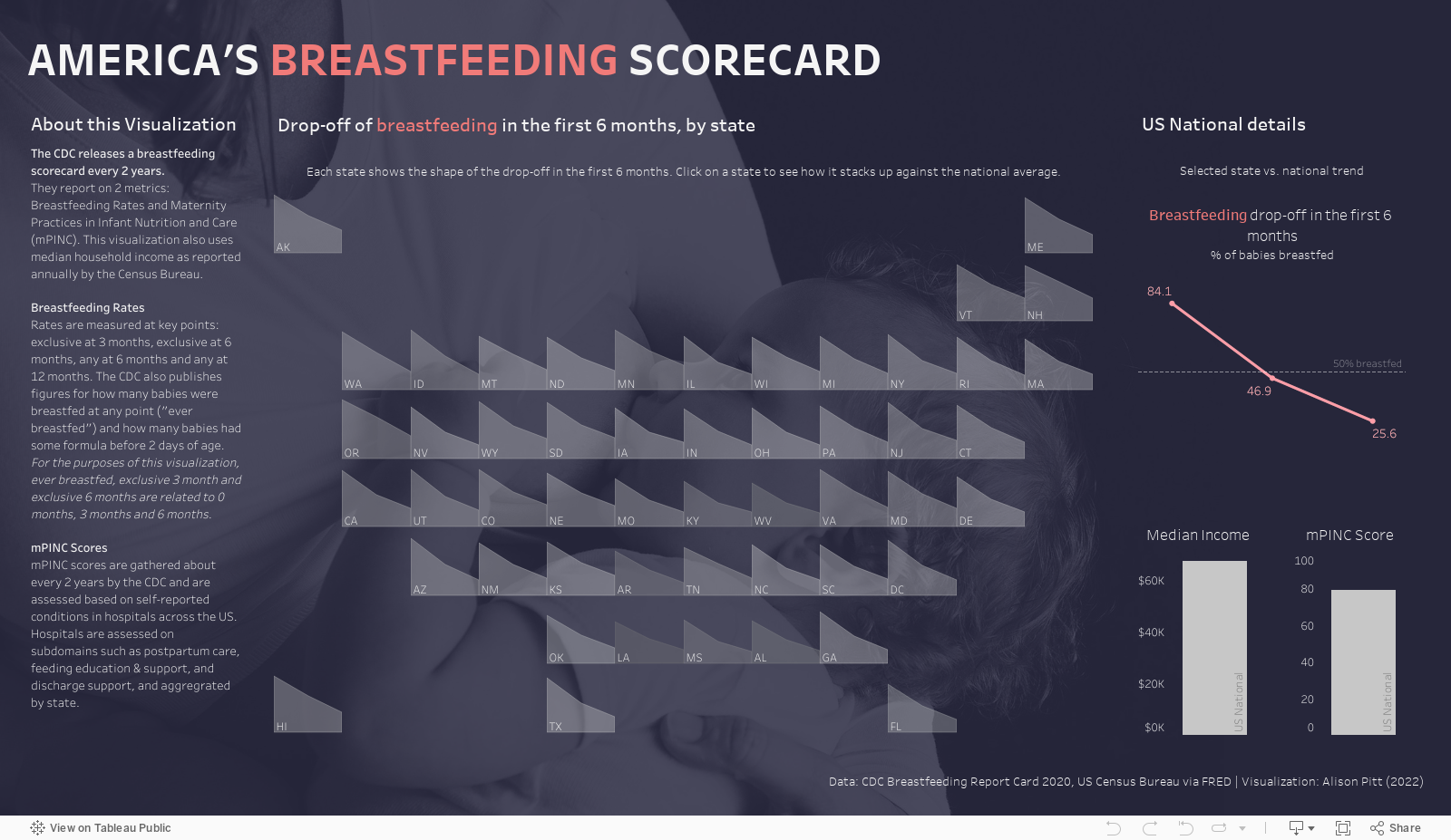
The CDC and the Census Bureau have good, relatively recent data on these subjects, so the datasets were robust.

It’s worth noting this is the first time I have used Alteryx to get the data into shape before doing a Tableau Public viz. It’s an understatement to say: I’m a fan.

In Data Viz Tags Tableau
← What size dashboard should you use for a nice Tableau Public thumbnail?Surveys and heat maps: Viz for Social Good 2021 →

Search

No results found
Post Archive
  • May 2024 1
  • September 2023 1
  • June 2023 1
  • May 2022 1
  • January 2022 1
  • October 2020 2
  • September 2020 2
  • August 2020 2
  • July 2020 7
  • June 2020 4
  • November 2017 5
  • October 2017 4
  • September 2017 4
  • August 2017 1

Featured Posts

Featured
How to Set up a 2-Record Seed to do Math in Tableau
Data Viz
How to Set up a 2-Record Seed to do Math in Tableau
Data Viz

When you’re exploring math concepts in Tableau, you don’t necessarily need a full data set to do it. Here’s how to use a 2-record seed to create an expanding data set for all your math exploration needs (in my case, learning about triangular numbers).

Read more →
Data Viz
An Exploration of Incomplete Open Cubes
Data Viz
An Exploration of Incomplete Open Cubes
Data Viz

For a recent JLL viz challenge and Iron Quest, I explored an Alteryx + Tableau recreation of Sol LeWitt’s “Incomplete Open Cubes” (1974). I created all the cubes, then I visualized them in Tableau; this is how I did it.

Read more →
Data Viz
What size dashboard should you use for a nice Tableau Public thumbnail?
Data Viz
What size dashboard should you use for a nice Tableau Public thumbnail?
Data Viz

It’s not obvious what dashboard aspect ratio to aim for if you want a nice-looking thumbnail on Tableau Public, but I did some digging and found the best one. For now, at least.

Read more →
Data Viz
Let's talk about recovering from setbacks
Audio Production, Data Viz
Let's talk about recovering from setbacks
Audio Production, Data Viz

I scrapped a whole video because it wasn’t up to scratch. Afterward, I made a video about not making a video. Let me explain!

Read more →
Audio Production, Data Viz
7 things you can do to up your data game while job searching
Data Viz
7 things you can do to up your data game while job searching
Data Viz

So, you’re a data nerd, you’re looking for a new job, and you just reached the end of the list of jobs to apply for. What do you do next? This is exactly the situation that I have found myself in several times in the last few months, so I thought I’d compile a list of the things that I’ve done to keep myself engaged while in a lull.

Read more →
Data Viz
Visualizing Star Trek
Data Viz
Visualizing Star Trek
Data Viz

It’s no surprise that I’m into Star Trek. So what happens when my love of data collides with my fandom? I make a viz that turns the scripts of my favorite movies into an explorable piece of art.

Read more →
Data Viz
A few pitfalls of the small data set
Data Viz
A few pitfalls of the small data set
Data Viz

Think a small data set is easier to visualize? Think again. You have to pay as much attention to what’s NOT in the set as what is…or you risk misinforming your audience! This article explores some of the recent pitfalls I tried to avoid in the latest Makeover Monday challenge.

Read more →
Data Viz
Vintage Viz: Beautiful rings on your Linux desktop with Conky
Data Viz
Vintage Viz: Beautiful rings on your Linux desktop with Conky
Data Viz

System stats can be beautiful, too. Once upon a time, I used Conky on Ubuntu to visualize things like memory usage, disk space and battery percentage, rendered as dynamic rings right there on my desktop.

Read more →
Data Viz

Affiliate disclosure - Privacy policy - Terms of use