

If you’re a pixel-perfection hunter like I am, you’ve probably noticed that thumbnails in Tableau Public are maddeningly obtuse. WHY do some dashboards look so good while others look so TERRIBLE? And why does it seem to arbitrarily cut off either the right side or the bottom of every dashboard?
I’m still holding out hope that one day we’ll get customizable thumbnails, but until that day, allow me to point out:
If you want a nice thumbnail, simply create a dashboard with an aspect ratio of roughly 1.6129:1.
Arbitrary? Yes! Scientific? Probably not! But it works. Read on to find out why…
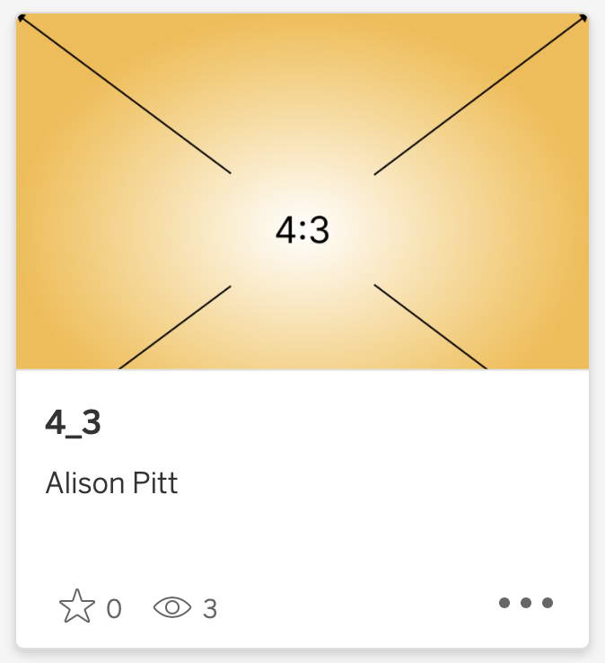
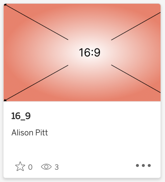
I set out this afternoon to finally figure this out after years of using Tableau Public…and Google was disappointingly unhelpful. So I decided on trial and error. I knew that it has something to do with aspect ratio since I’ve qualitatively observed over time that HD-style dashboards (16:9) tended to cut off the right side, and fatter-style dashboards (4:3 or long-form) tended to cut off the bottom. So I used Figma to create two images, one in 16:9 aspect ratio and one in 4:3. Then I made them into dashboards.
…and neither thumbnail is quite right.
The 16:9 dashboard was closer so I Googled aspect ratios near 16:9 and it turns out that 16:10 is apparently enjoying a rise in popularity, so I tried that one too. Still not quite right. It still cuts off a bit at the bottom.

How a 16:10 dashboard appears on Tableau Public
Next, I turned to my old friend: “Inspect Element”. Right-click on anything in a web browser and you can view the code that makes up that element. With images, it will usually give you more information about things like padding and styles. Sure enough, it showed that the thumbnails on Tableau Public on my Safari instance are 319 x 198, an aspect ratio of 1.612903 to 1.

Inspecting elements on the Tableau Public website reveals the dimensions of thumbnail images
I tried a couple other browsers, too: an iPad with Safari and a Windows PC with Chrome. In each, it came out to about 1.6129:1.
So I made a new dashboard with a 1.6129:1 aspect ratio and it looks great in the thumbnail.

How a 1.6129:1 dashboard appears on Tableau Public
Should you make every dashboard with a 1.6129:1 aspect ratio? Probably not. Dashboards should be the size they need to be in order to be used for the purposed they’re designed for. But at least now you have a guide to getting a nice thumbnail on Tableau Public. And if they change the design in the future, you should hopefully be able to readjust, as well. Enjoy!
You can view all of these aspect ratio dashboards on my Tableau Public: